
Musings on Tarot Decks—- Dark Days – Tarot –
I’ve never been a fan of black and white tarot decks, I’ll admit this right up front. Maybe because I’m a painter, color always plays a big part in my appreciation of the Tarot cards I’m working with. So, when my good friend Terry gifted me with this deck, I was surprised that I liked it. Here was an unusual deck I didn’t have. But black and white? It goes to show you we can’t always judge by first appearances.
The Dark Days Tarot deck was created by by Wren McMurdo and Emily Mundy.

(I love her tattoos!)
McMurdo says these square black-and-white tarot cards were inspired by the light and shadow of the moon, especially the dark days of the lunar cycle. 78 Tarot cards housed in a cute square box with a thick, square 180 page flip guidebook.

The deck I have is the first edition of this deck, originally released as a Kickstarter campaign in 2016. The newest releases have gilded edges and a glossy finish. The finish of my deck is flat, with no gilded edges.
One of my favorite things about this deck is the box.

I feel superficial saying this, but it is truly a great box. It feels good. It’s square, the bottom of the box is white with black illustrations of the Suits (half full wine glasses are Cups,Wands are flowering branches) all around the perimeter.The top is the reverse but illustrated with the moon and clouds instead. On the inside of the white bottom box are eleven (I counted) tiny birds. On the inside bottom of the dark box lid is a miniature moon. These are the details that make this deck special. The bottom of the box even has a ribbon that lifts the cards out of their cradle, an addition I always appreciate.

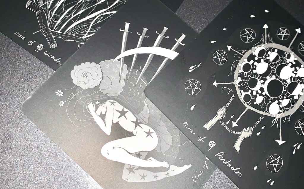
The Dark Days Tarot is an all black & white deck (with some gray). The Major Arcana cards all have a white background, while the Minor Arcana cards all have black backgrounds.The deck was originally released as a Kickstarter campaign back in late 2016 and the first decks started shipping out in early 2017. I am reviewing the 1st edition, the newest releases have gilded edges and a glossier finish to the cards.
There is a blog: https://www.darkdaystarot.com/dark-days-blogThe blog is a simple website, but it does include a few tricks. One is an interesting quiz to do to determine our ‘Psychic Element”.

You will also find a clever page where you can play with the cards virtually, move them around, and click on one for a description.

The ways in which the printing of this deck was carbon neutral is placed at the foot of the website.
What I like: I really like the way the cards were organized for packaging. It may seem like a small thing, but most Tarot decks are organized in the traditional order starting with The Major Arcana first. Then the Suits, one Suit at a time, in numerical order and from Ace to King.
The Dark Days Tarot breaks that tradition by beginning with -0-Fool, then all the Aces, then The -l-Magician, then all the Two’s, then the -ll- Priestess, etc. I love this, because It’s almost exactly how I teach my beginning Tarot workshops.

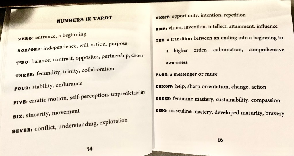
I think learning the number of each card in the Minor Arcana first makes reading the Tarot easier, so of course I’m impressed that the creators encourage the reader to address this as soon as the cellophane is removed. Easy information about each number is even in the guidebook:
I really like the Eight of Pentacles.

It’s an image of a woman at a sewing machine creating pentagram after pentagram. This is such a great metaphor for the work it takes to get good at something.
I really like the Knight of Swords, too:

Many decks wrestle with the knight’s images—male or female? This card eliminates identification completely and the horses are obviously racing (or flying). It works.
Also, the cards are square. From the back you can’t tell which end is up at all, and they are meant to be read from all four directions. You can see the card pointing in a direction as a clue about the topic in question. Or, much like reading reversals in standard decks, each direction can mean you have to see this card or situation from a slightly different angle. It’s clever.
What I don’t like: The print is VERY small, stylized cursive. Even wearing reading glasses, the names of the Suit cards against their black background are almost impossible to read in anything but bright light. I like to play with spreads at night so unless I have all these cards memorized, this is problematic.
Also, this deck is very feminized, very ‘girlie’. No male images at all. This feels too much like a gimmick, or an affectation. Some women may live in or prefer a man-free world but I don’t, so that type of deck doesn’t work for me at all because it isn’t reflective of my life.
I think The Fool is disappointing.

It feels like it belongs in a comic book, especially the image of the baby.
The Layout: Here is the layout included in the Dark Days guidebook.
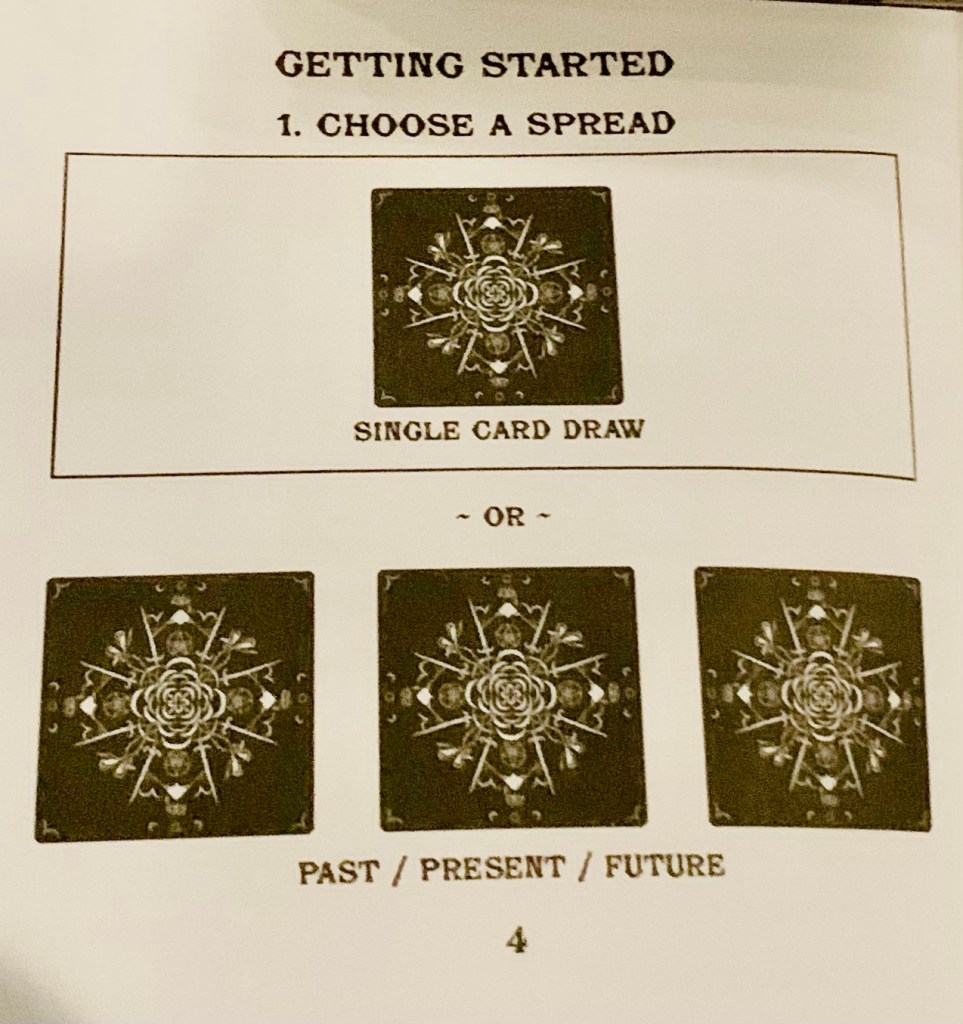
Basic, simple.
These ‘layouts’ live in the front of the guidebook along with some really good basic lessons in beginning Tarot, but I don’t see this deck as a beginning Tarot readers deck at all. It’s an interesting dichotomy.
So, there you are. An interesting novelty deck, but not one I’d use regularly.
